Disclaimer: This article is not intended to be a recommendation. The author is not responsible for any resulting actions of the company during your trading experience. The information provided in this article may not be accurate or up-to-date. Any trading or financial decision you make is your sole responsibility, and you must not rely on any information provided here. We do not provide any warranties regarding the information on this website and are not responsible for any losses or damages incurred as a result of trading or investing.
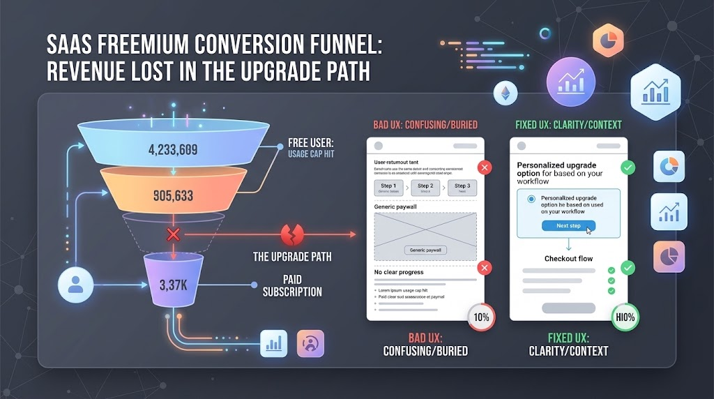
Why the upgrade path, not the free plan itself, is usually where a freemium product loses the customers it already earned.
A free user who hits a usage cap and can’t find the upgrade button doesn’t file a support ticket. They just leave, and the churn dashboard records it as a product-fit problem instead of what it actually was: a billing screen nobody user-tested. Most freemium teams spend their design budget on the parts of the product free users see every day, then hand the checkout flow to whichever engineer finished a sprint early.
That imbalance shows up in the conversion numbers before it shows up anywhere else. A UX agency auditing a freemium product for the first time almost always finds the same pattern: the free experience is polished, the paid upgrade path is an afterthought, and the gap between the two is exactly where the product is losing revenue it already earned the right to collect.
Pricing tiers, usage limits, and packaging decisions matter, but plenty of freemium products with reasonable pricing still convert poorly because the path from “I hit a limit” to “I’m now paying” is confusing, slow, or buried three menus deep. That path is a design problem before it’s a business-model problem, and it’s one most product teams never formally own.
Where the freemium funnel actually breaks
The moment a free user decides they want more is the highest-intent moment in the entire product experience, and it’s also the moment most SaaS products handle worst. A user hits a limit, sees a generic upgrade modal with no context for their specific usage, and has to leave the workflow they were in to go compare plans on a separate page. Each of those steps is a chance to lose someone who had already decided to pay.
Usage-limit messaging is the first failure point. “You’ve reached your plan limit” tells a user what happened but not what to do next, what it costs to fix, or what they specifically get for upgrading. A message tied to the exact action the user was trying to take, with the specific plan that unlocks it, converts at a meaningfully higher rate than a generic paywall, because it answers the only question the user actually has at that moment.
The second failure point is the handoff between the in-app prompt and the pricing page itself. A user who clicks “Upgrade” from inside a workflow and lands on a marketing pricing page built for cold visitors, complete with a comparison table of every plan and feature ever shipped, has to re-orient before they can even find the plan relevant to them. That re-orientation cost is where a lot of high-intent upgrades quietly die.
According to Clutch’s 2025 web development research, websites built with responsive, mobile-optimized design see conversion rates roughly 11 percentage points higher than non-responsive designs. (Clutch, 2025)
That gap matters more for billing screens than almost anywhere else in a SaaS product, since a meaningful share of usage-limit prompts get triggered on a phone, mid-task, when a user is least willing to fight a cramped plan-comparison table designed for a desktop monitor.
Three self-serve upgrade patterns, compared
Most freemium products limit access one of three ways, and each creates a different design problem at the moment a user decides to pay.
| Limit model | What triggers the prompt | Main design risk |
| Feature-gated | User clicks a locked feature | Prompt feels like a wall, not a next step |
| Usage-capped (seats, records, API calls) | A running count crosses a threshold | User doesn’t see the cap coming, feels ambushed |
| Time-boxed trial | A calendar date, not user behavior | Prompt arrives disconnected from active intent |
Usage-capped limits tend to convert best when the design surfaces the running count before the user hits it, since a visible “80% of your plan used” state lets someone plan the upgrade instead of being interrupted by it. Feature-gated limits convert best when the locked feature is visible but not fully hidden, so the user can see exactly what they’re missing rather than guessing at it.
What a proper billing UX audit actually checks
A UX agency running a real audit of this flow doesn’t start with the visual design. It starts by pulling the actual drop-off numbers between the moment a user hits a limit and the moment they complete payment, then walks through every screen in that path as a first-time user would, on both a desktop browser and a phone. Most of what surfaces in that walkthrough has nothing to do with color or layout and everything to do with sequencing: which screen shows up first, what information it assumes the user already has, and how many decisions it asks for before it lets them pay.
A UX agency worth hiring for this specific problem will ask to see the funnel data before proposing any redesign, since a redesign based on assumption rather than the actual drop-off point tends to fix the wrong screen. If the steepest drop happens on the plan-comparison page, redesigning the confirmation screen afterward won’t move the number that matters. The output of a good audit is usually narrow: two or three specific screens to redesign, not a full product overhaul. That narrow scope is a feature, not a limitation, since it keeps the fix testable against the same funnel data that flagged the problem in the first place.
Your browser does not support embedded video.
Why this keeps landing on engineering instead of design
Billing flows get treated as a technical integration problem, not a design problem, because the hard part looks like it’s the payment processor, the proration logic, and the webhook handling. That part is genuinely technical. But the screens a user actually sees, the upgrade modal, the plan comparison, the confirmation state, are pure interface design, and they usually get built by whoever wired up the payment API rather than reviewed by anyone who designs the rest of the product.
Oleksandr Kostiuchenko, Marketing Manager at Phenomenon Studio, has seen this pattern across freemium products at very different scales: the team that agonizes over onboarding copy will ship a checkout flow nobody outside engineering ever looked at. His view is that a billing flow deserves the same design review as any core feature, since it’s the single screen most directly tied to revenue, and treating it as plumbing rather than product is a decision, even when nobody consciously makes it.
Dashboard-heavy products carry an extra version of this problem, since the upgrade prompt often has to interrupt a data-dense screen without breaking the user’s context. Dashboard designers who specialize in this kind of interface tend to solve it with an inline banner tied to the specific chart or table the user was working in, rather than a full-screen modal that throws away their place in the workflow.
A Gartner sales survey found that 67% of B2B buyers prefer a rep-free purchasing experience, with a majority favoring a fully digital, self-service path to completing a purchase. (Gartner, 2026)
A self-serve upgrade flow is exactly the moment that preference gets tested. A buyer who wants to pay without talking to a salesperson and instead hits a “contact sales” wall on a plan they assumed was self-service will often just leave rather than start a sales conversation they were actively trying to avoid.
The fix keeps the self-service path genuinely self-service up to whatever point the pricing model actually requires a conversation, without cutting sales out of higher tiers entirely, and it makes that line explicit instead of letting a buyer discover it mid-checkout. A plan page that quietly routes every serious upgrade toward a sales form, despite advertising self-service pricing, creates exactly the kind of mismatch between expectation and experience that pushes a ready buyer to walk away.
What a strong fix actually looks like in practice
The right UX agency for this kind of problem treats the upgrade funnel as its own product, not a side quest attached to the main redesign. That means pulling the actual drop-off data before proposing anything, prototyping the two or three highest-friction screens, and testing those prototypes against real usage patterns rather than a generic best-practices checklist. A UX agency that skips straight to visual concepts without that data step is guessing at the same problem from a different angle.
Dashboard designers face a narrower but sharper version of this challenge, since the upgrade prompt has to compete with a screen the user is actively working in, not a page they navigated to. Dashboard designers who treat the prompt as a separate overlay rather than part of the same visual system tend to produce something that feels like an interruption rather than a natural next step. The dashboard designers worth shortlisting can describe, specifically, how they’d surface a usage warning inside a chart or table without breaking the user’s flow.
Web development agency partners brought in to implement the fix need the same funnel data the design team used, not just finished screens to build. A web development agency working from mockups alone, without visibility into where users actually drop off, tends to implement the visual fix correctly while missing the sequencing change that would have actually moved the number.
Website design services and website development company quotes for this kind of work should separate the billing-flow fix from general site maintenance explicitly, since bundling them under one flat retainer usually means the higher-impact billing work gets the same attention as a routine content update. A web design agency asked to scope this work should be able to name the specific screens involved before quoting a number, not estimate against a vague description of “improving checkout.”
A useful test before signing anyone: ask a prospective UX agency to sketch, even roughly, how they’d redesign the usage-limit warning for a dashboard-heavy product specifically. Dashboard designers who can answer that on the spot have done this work before, and so can a web design agency or a UX design agency confident enough to walk through a real screen instead of a portfolio slide. The same applies to web app development and mobile app development services scoped for this fix: ask for the specific screens each covers, not a general capability list, and treat web design services or website design services quoted as an afterthought to a broader retainer as a sign the billing flow won’t get the attention it needs.
Common mistakes in freemium billing design
- Burying the upgrade path behind account settings. If upgrading takes more than two clicks from the point of friction, most users won’t go looking for it.
- Showing every plan and feature at once. A user who hit one specific limit doesn’t need a full feature matrix. They need the one plan that solves their immediate problem, shown first.
- Treating the confirmation screen as an afterthought. A vague “you’re all set” after payment leaves a user unsure whether the thing they were trying to do actually unlocked.
- No visible warning before a hard cap. Users who get cut off with no warning associate the interruption with the product failing, not with their own usage.
- Reusing marketing pricing pages for in-app upgrades. A page built to persuade a cold visitor is a poor match for a warm user who already decided to pay and just needs a fast path to do it.
Who actually gets hired to fix this
When a freemium product’s leadership finally traces a revenue problem back to the upgrade flow, the search for help rarely starts with a clear brief. Some teams look for a web development agency assuming it’s purely an engineering fix. Others search for a website development company, thinking of it as a marketing-site problem rather than an in-app one, when the actual gap sits inside the product itself, not the public site.
The confusion deepens once mobile enters the picture. A team that also ships a companion mobile app might bring in a mobile app development company for the native side while a separate mobile app development agency handles a different surface, and a mobile app development services provider gets pulled in for a one-off fix, with nobody owning how the upgrade experience behaves consistently across web and native. A web app development effort that treats the browser upgrade flow and the native one as unrelated projects usually ships two inconsistent versions of the same decision screen.
Design-side hiring gets just as scattered. A team might hire a web design agency for visual polish, a separate UX design agency for the interaction logic, and a UI UX design services vendor for the research, when a single team handling all three tends to catch the handoff gaps the others miss. Website design services and web design services quotes that treat the billing screens as just more pages in the site, rather than a distinct, conversion-critical flow, routinely underscope the actual work involved.
Website development agency and web development services engagements that bolt a payment integration onto an existing product often leave the surrounding screens exactly as they were, since the brief was “add billing,” not “redesign the upgrade experience.” That’s a reasonable scope for a narrow technical fix, but it rarely solves the conversion problem, since the technical integration was never where the user was actually getting stuck.
Branding companies occasionally get pulled into this conversation too, usually when a founder notices the upgrade flow looks visually inconsistent with the rest of the product and assumes a fresh coat of brand polish will fix it. It rarely does, since the underlying problem is almost always about sequencing and clarity, not color and type.
The teams that actually close this gap tend to treat it as one connected problem: audit where users drop off, redesign the specific screens involved, and test the change against real usage data rather than a general redesign brief.
None of that requires a large engagement. A focused review of the five or six screens between “user hits a limit” and “user is now paying” is usually enough to find where the friction lives, and fixing that handful of screens tends to move the conversion number more than a broader redesign would.
Sequencing the fix matters too. Redesigning the confirmation screen before fixing the usage-limit prompt earlier in the funnel wastes effort on a screen fewer users ever reach in its current form. Starting with the highest-drop-off screen first, then working backward through the funnel, keeps each round of changes testable on its own rather than shipping a full rewrite and hoping the aggregate number improves. It also gives a team an early result to point to, which matters when a design fix has to compete for engineering time against every other item on a growth-stage roadmap.
Frequently asked questions
Why do freemium products convert poorly even with reasonable pricing?
Pricing and packaging get most of the attention, but the actual upgrade screens, from the trigger modal to the plan picker to the final confirmation, are often the least-designed part of the product. A confusing or slow path from intent to payment loses users regardless of how fair the pricing is underneath it.
Should the upgrade prompt appear before or after a user hits their usage limit?
Before, when possible. A visible progress indicator that shows a user approaching their limit lets them plan the upgrade, while a hard stop with no warning tends to read as the product failing rather than a natural next step.
Is it better to show one recommended plan or a full comparison table at the upgrade moment?
One recommended plan, tied to whatever the user was trying to do when they hit the limit. A full comparison table is useful for a cold visitor evaluating options, not for a warm user who already decided to pay and just needs the fastest path to the plan that solves their specific problem.
Is the upgrade-flow problem just as bad on a phone as on desktop?
Yes, and often more urgently, since a cramped upgrade modal is harder to use on a phone than on a desktop screen. Teams that design the web upgrade flow carefully and then ignore the mobile equivalent usually see the mobile conversion number lag behind for exactly that reason.
How much of this problem is engineering versus design?
The payment processing and proration logic are engineering problems. The screens a user actually interacts with, from the upgrade prompt through the comparison view to the confirmation, are design problems, and they’re frequently built by whoever wired up the payment integration rather than reviewed by anyone focused on interface design.
What should a team measure to know if its billing UX is actually the problem?
Track the drop-off between “user hits a limit or clicks upgrade” and “user completes payment” as its own funnel, separate from total free-to-paid conversion. A steep drop inside that narrow funnel points at the upgrade screens themselves rather than pricing or product fit.
Can a small, focused redesign of just the billing screens move conversion, or does it require a full product redesign?
A focused fix is usually enough. The handful of screens between hitting a limit and completing payment are a contained, testable scope, and fixing that path tends to move conversion more directly than a broader redesign that doesn’t specifically target the upgrade moment.