Disclaimer: This article is not intended to be a recommendation. The author is not responsible for any resulting actions of the company during your trading experience. The information provided in this article may not be accurate or up-to-date. Any trading or financial decision you make is your sole responsibility, and you must not rely on any information provided here. We do not provide any warranties regarding the information on this website and are not responsible for any losses or damages incurred as a result of trading or investing.
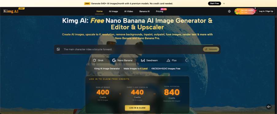
A small music night often has a strong identity in the room and a weak identity online. The artists know the mood, the venue has character, and the audience understands the scene, yet the first poster draft may look like a generic template. Generative image tools can help promoters explore visual directions before committing to a final design. With Nano Banana, a team may begin from a written idea or an existing image, but the useful part is not instant artwork. It is turning the event’s atmosphere into a visual brief that designers can actually use.
Start With the Feeling People Will Meet at the Door
Describe the event as an experience rather than a list of genres. “Indie rock night” is too broad. “A low-ceiling basement show with warm red light, hand-stamped tickets, and a crowd standing close to the stage” gives the image a place, temperature, and rhythm.
Talk to the organiser, venue, or headlining act and collect three sensory details. Ask what the room feels like before the first song, what object people associate with the venue, and what should never appear in the promotion. These answers create a stronger starting point than searching for whatever style is currently popular. When testing those directions with Nano Banana Pro, keep each prompt focused on one atmosphere rather than asking for a finished poster. The image should invite the right audience into this particular night. Add a practical audience sentence to the brief, such as “This should feel welcoming to people who like discovering new bands, not exclusive to existing scene insiders.” That sentence affects how dark, crowded, polished, or confrontational the concept should become.

Separate Event Identity From Artist Identity
A poster needs to represent the event without misrepresenting the performers. If an artist already has established photography, typography, colors, or symbols, treat those as protected material. Do not ask a generator to redesign a person’s face, invent a costume, or create a fake performance photograph unless the artist has approved that direction.
Use generated visuals for the shared world around the lineup: textures, environments, abstract motifs, and illustrative objects. The event identity may be gritty, playful, theatrical, or minimal while the artist assets remain accurate. This separation makes collaboration easier because performers can approve how their names and images appear without controlling every background decision. It also gives the promoter a safer fallback. If one artist changes their approved photo or leaves the lineup, the event environment can remain while the factual layer is updated separately.
Build the Concept in Three Controlled Passes
Jumping straight to a finished poster creates too many variables. Develop the visual in stages so each decision can be reviewed separately.
- Explore the Environment
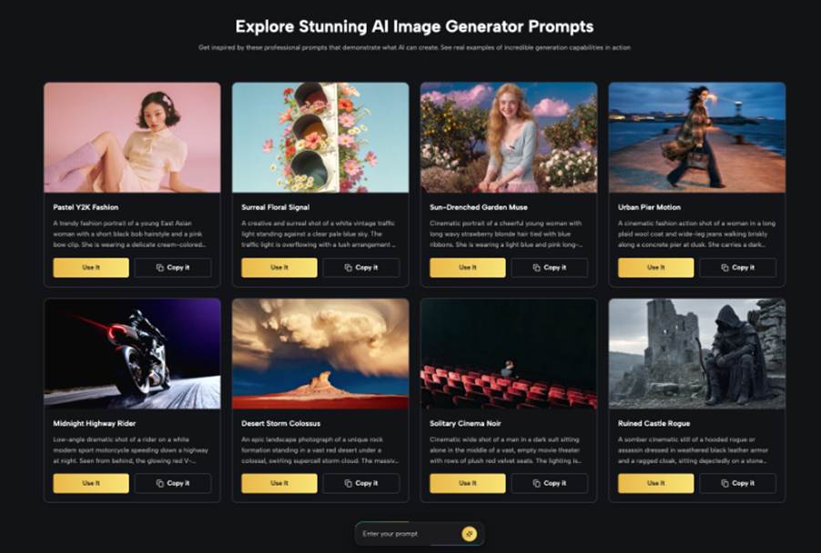
Generate several scenes without performer names or final typography. Focus on lighting, setting, color balance, and the amount of visual noise. For a local festival, one direction might suggest streets after rain; another might use cut-paper shapes inspired by venue architecture. Compare the concepts at thumbnail size. The strongest direction should communicate the event mood before anyone reads a line of copy. Keep one rejected direction and note why it failed; that record helps prevent the same generic idea from returning later.
- Add Recognisable References Carefully
Once the environment works, bring in approved references such as a venue exterior, a recurring mascot, or an object from the event’s previous artwork. Nano Banana AI supports image-based creation and multiple references, which makes it useful for testing how familiar elements might sit within a new visual treatment. Keep the reference role clear. A venue photo may guide shape and atmosphere without becoming a false documentary image of the event.
- Hand the Visual to the Layout Stage
Choose one background or illustration and move it into the design software used for the final poster. Add names, dates, ticket information, sponsor marks, and accessibility details there. This keeps essential text editable and prevents small errors from becoming part of the image. It also lets the designer create a clear hierarchy rather than forcing copy into whatever empty areas the generated scene happened to leave.
Treat Typography as Information, Not Decoration
Music posters often become unreadable because atmosphere is allowed to overpower the details. The event name, date, venue, and ticket path must survive quick viewing on a phone. Set the type over the image only after checking contrast in the real crop.
Use one expressive type choice for personality and a simpler face for practical information. Avoid placing text over faces, bright lights, or detailed textures. If the visual leaves no calm area, revise the image instead of shrinking the copy. A poster succeeds when someone can understand it while scrolling, then discover more character when they stop to look. Test the design with the screen brightness lowered and from arm’s length. These ordinary viewing conditions expose weak contrast more reliably than a large monitor at full brightness.
Adapt the Concept for Every Place It Appears
A wide event page, a square social post, a vertical story, and a printed flyer cannot rely on one crop. Decide which part of the concept is essential. It may be a central object, a color transition, or the relationship between two figures.
Create layout variations rather than stretching the same poster. The vertical version may move the lineup below the image, while the square version uses a tighter crop and shorter supporting copy. Keep the visual cue consistent so people recognise the event across platforms. Test each version at actual viewing size, especially the smallest social card, where decorative details disappear quickly. Create a plain backup version for listings that impose severe crops or place interface labels over the image. The backup should retain one recognisable motif instead of squeezing the full poster into an unsuitable frame.
Review the Work With People From the Scene
A visual may be technically strong and culturally wrong. Show early concepts to the venue team, performers, or someone who regularly attends similar events. Do this before the lineup announcement, when changes are still easy. Ask reviewers to respond separately rather than discussing the image as a group first; independent reactions reveal whether the same unintended message appears more than once. Ask what kind of night they expect from the image and which details feel false.
Listen for mismatches rather than requests for personal taste. If people expect a polished seated concert but the event is a loud standing show, the brief has missed the experience. Check for borrowed symbols that belong to another community or era. Local music identity is built from specific places and people. Generated imagery should support that identity, not flatten it into a universal “cool music” style. Keep a short note explaining the references used in the concept. This helps the team avoid accidentally borrowing visual language from a community, genre, or cultural symbol they do not understand.
Conclusion
Independent events do not need endless visual options. They need one direction that feels true to the room, respects the artists, and remains readable across every format. Begin with sensory details, separate event atmosphere from performer identity, and develop the image in three controlled passes before adding final text. That process makes AI useful as a concept tool without asking it to replace design judgement. For your next event, write a five-line atmosphere brief before opening a template or generating the first image.